Portfolio
A curated mix of client work and creative exploration, always evolving.
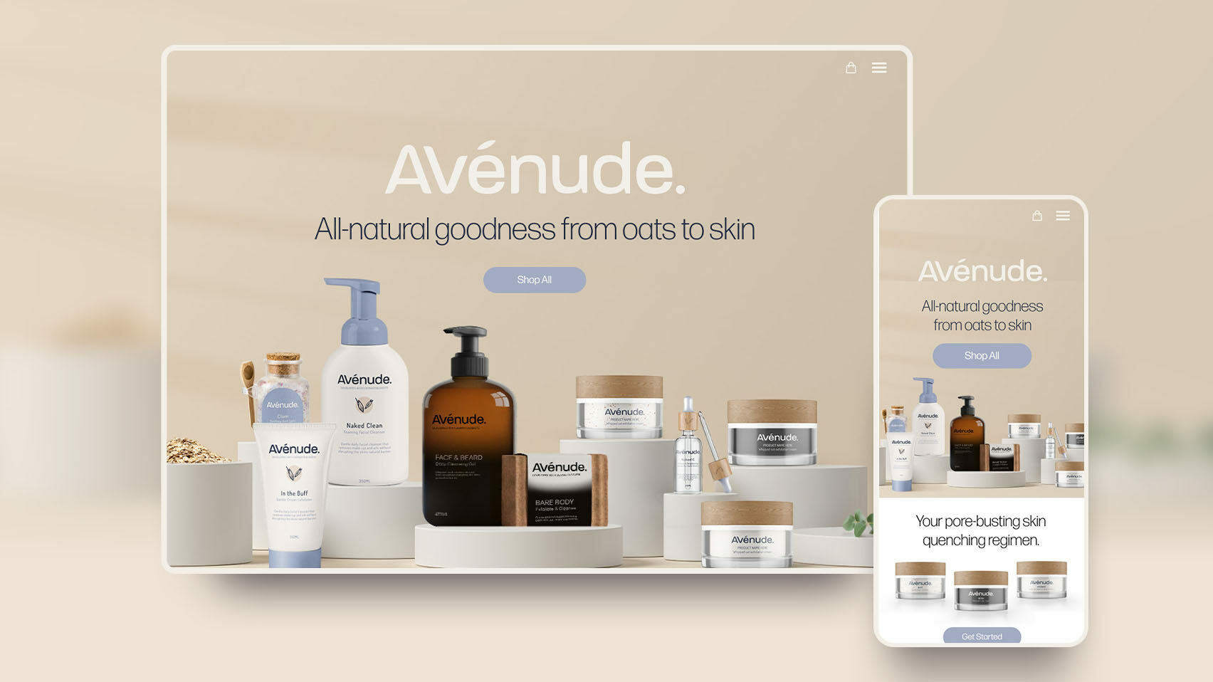
Avénude
Brand Identity, Packaging, Digital Design, Website, Illustration
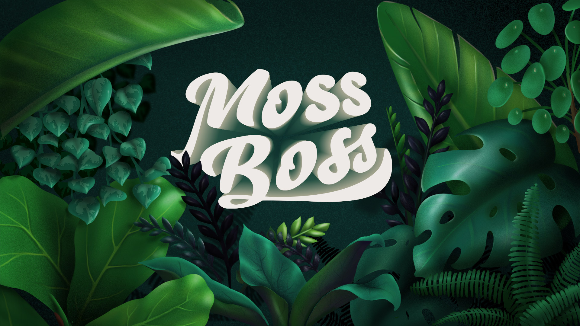
Moss Boss
Brand Identity, Packaging, Digital Design, Website, Illustration
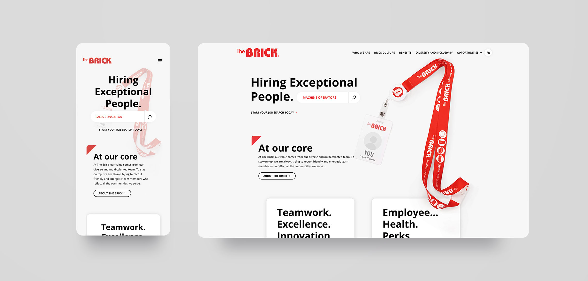
The Brick
Web Designer
Dec 2019 – Jan 2022
Edmonton, Alberta
UI Playground
A collection of frontend work focused on creating interactive, user-driven experiences that feel as good as they look.
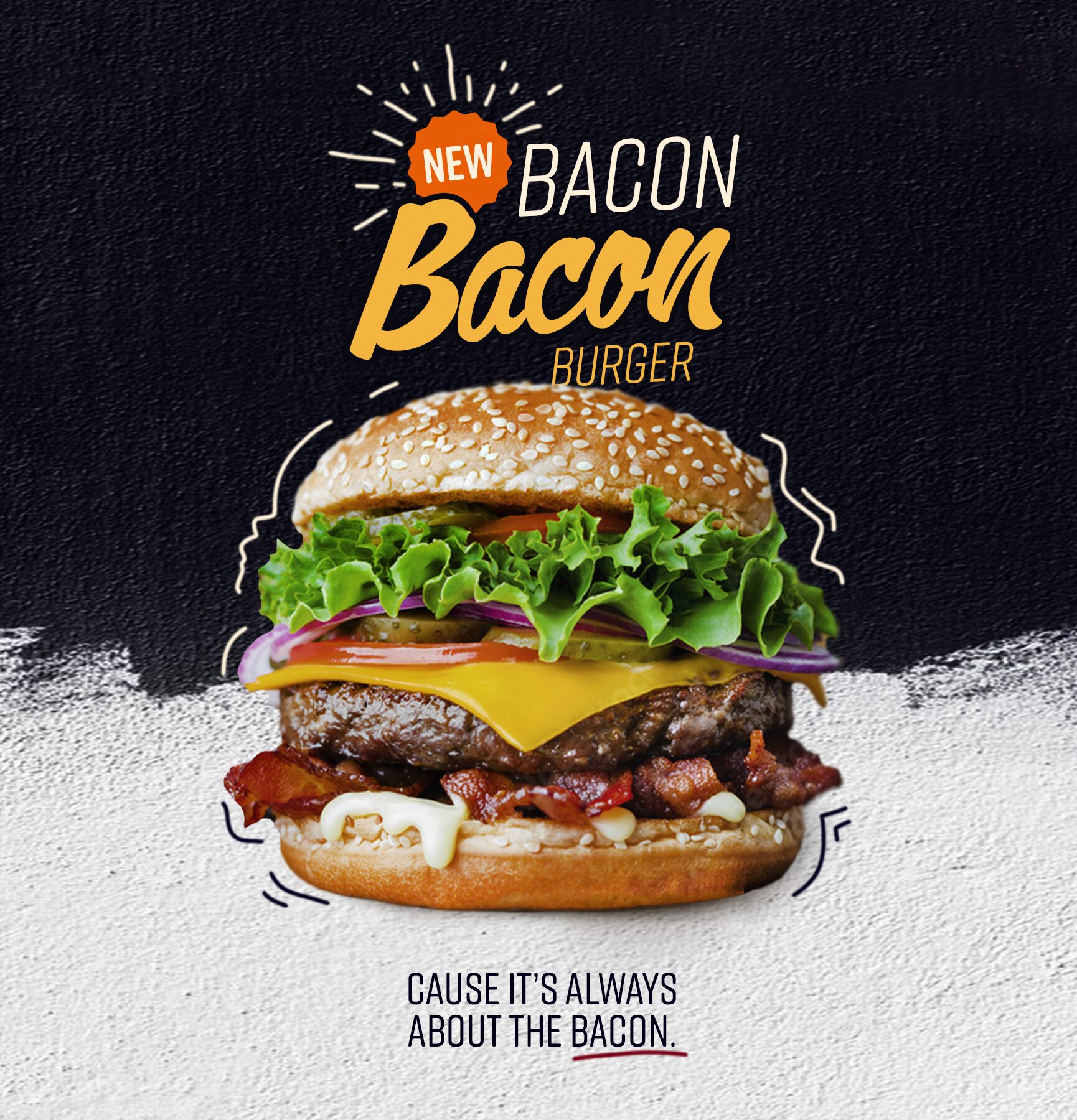
Brazen Bacon Smokehouse & Grille
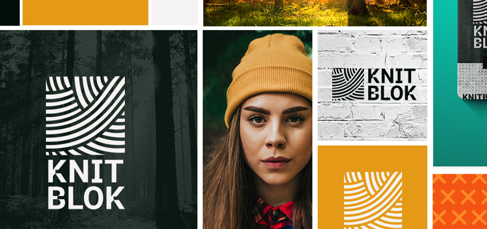
Knitblok
Brand Identity, Packaging, Digital Design
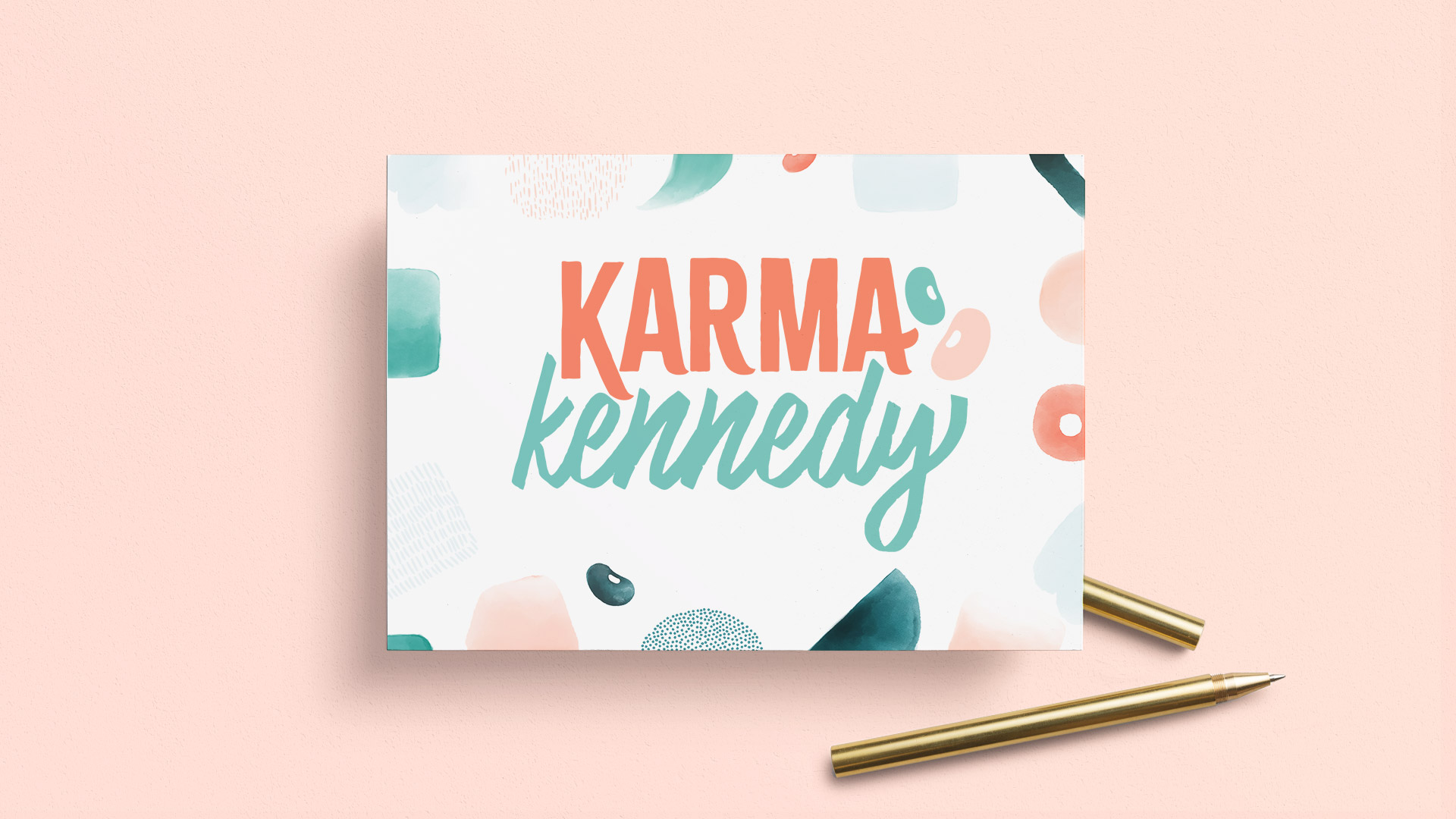
Karma Kennedy
Brand Identity
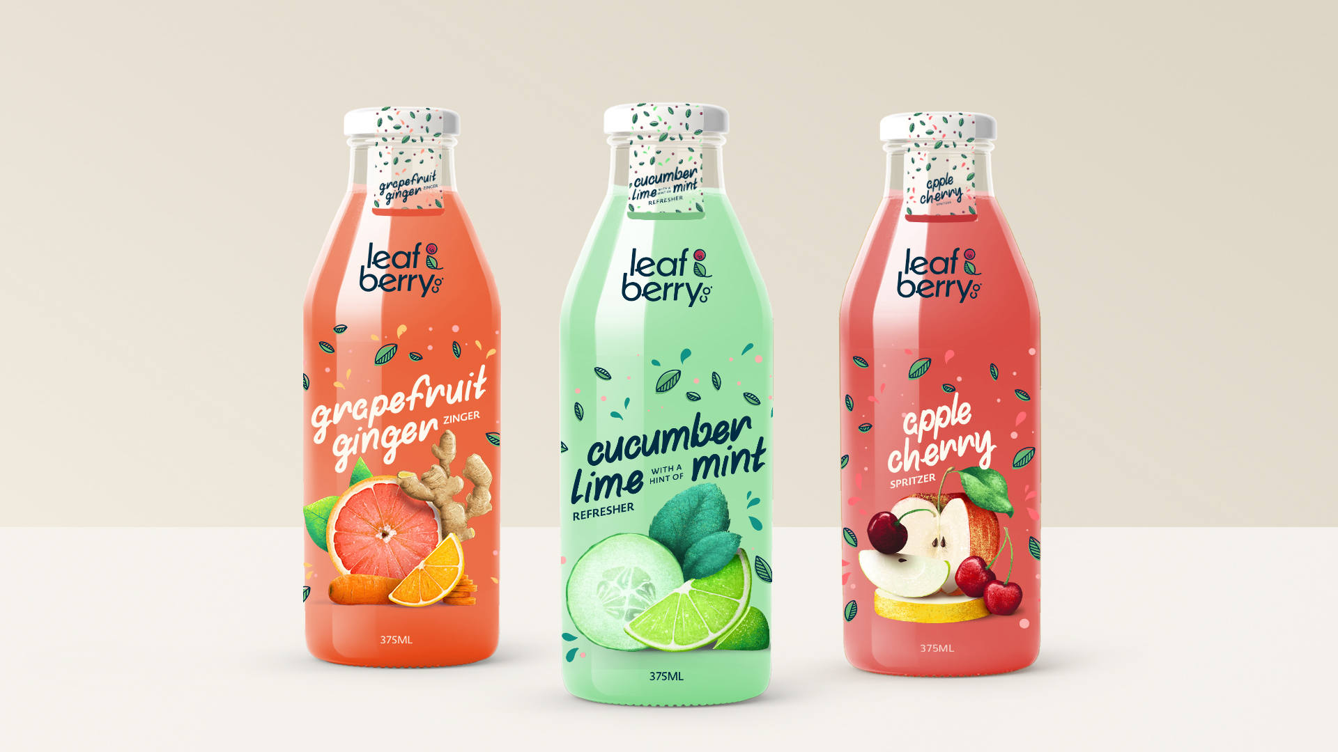
Leaf & Berry Co.
Brand Identity, Packaging, Digital Design, Illustration
During my time at The Brick, I contributed to a range of digital projects across the main website, designing and developing promotional artwork, email campaigns, and page layouts to support a constant rotation of marketing initiatives. This work required a balance of speed, consistency, and performance, ensuring each campaign felt cohesive across all digital touchpoints.
A key focus of my role was the complete redesign and development of The Brick’s Careers website, where the work shifted from ongoing production to a full transformation—modernizing both the design and functionality to better support recruitment and engagement.
The Approach
The redesign focused on simplifying the experience while strengthening visual impact.
I restructured the layout to guide users more naturally through the site, prioritizing clear entry points into job searches and improving overall flow. The interface was modernized with a clean, minimal design that allowed content to breathe while still reflecting The Brick’s bold branding.
Functionality played a key role in the redesign. Search and navigation were brought forward as primary features, making it easier for users to quickly find relevant opportunities. The experience was designed to be fully responsive, ensuring consistency and usability across devices.
The Results
The updated Careers website delivered a significantly more modern and functional experience.
A streamlined user journey from landing to job search
Improved visibility and accessibility of open positions
A clean, contemporary interface aligned with current design standards
A fully responsive experience across desktop and mobile
The redesign transformed the Careers platform into a more effective recruitment tool—one that better represents the brand while making it easier for users to engage and apply.
Brazen Bacon started as a quick, creative playground—a chance to build a bold, personality-packed food brand from scratch.
The goal wasn’t perfection or depth, but momentum: create something punchy, memorable, and visually delicious in a short amount of time.
From logo to promo, this project leans into unapologetic flavor and a slightly over-the-top attitude—because if you’re naming something Brazen Bacon, subtlety has already left the chat.
Goals & Vibe
Create a brand that’s:
- Bold, craveable, and attention-grabbing
- Confident, playful, and a little irreverent
- Instantly recognizable in a crowded food space
Think scroll-stopping visuals with just enough attitude to make you look twice (and probably get hungry).
What I Accomplished
- Brand identity & visual direction
- Logo design (mono + full color)
- Photo editing & hero composition
- Motion design for teaser promo
Future Plans
Expand into a full brand system, including packaging, menu design, website, and additional print and digital campaign assets.


This project focused on building a playful yet polished brand identity for a blogger, writer, and digital creator in need of a cohesive visual presence.
The design blends expressive typography with soft, hand-painted textures and organic shapes, creating a personality that feels both approachable and creatively confident. A custom logo system was developed alongside a suite of supporting background graphics, allowing the brand to flex seamlessly across blog content, social media, and digital touchpoints. The result is a cohesive visual language that elevates everyday storytelling into a recognizable, ownable brand—balancing personality, readability, and versatility in a way that supports both creative expression and long-term growth.
